So, I have been working on a little project and I am ready to open it for some thoughts and feedback.
I come from a Linux background and love the command line… BUT, I feel like some things, like firewalls, are easier to build in a more visual manner. Less thinking about the command syntax and if I have included all the necessary parts of a rule more about the structure of the rules. Additionally, my start with VyOS-like firewalls was on the Ubiquiti EdgeRouters and I liked their web GUI for the firewall.
To that end, I have been building a web app to visually build the firewall configuration for VyOS 1.4+, which I have been running via the rolling release for about 2 years. I would love to get some constructive feedback.
Keep in mind that the GUI does not directly edit the firewall or make calls to the CLI. Rather it build the CLI commands based on the GUI configuration. You can then cp/paste or download a .cfg file with the full CLI commands to create the firewall on your VyOS firewall.
Again, I am looking for constructive input. The code is licensed with the MIT license and available on GitHub. The tool is a Flask app (my first) and is packaged and available on Docker HUB for x86_64 and ARM64. In addition, full working version is available at https://vyos-fw-gui.com.
The working demo doesnt work, it wants a user/pass (but was easy to bypass since creating an account doesnt seem to verify the email).
I assume flowtable have been added to the options (couldnt find it)?
Perhaps other default options for firewall could be added aswell as configurable options?
The white text on yellow background is terrible to read (same with black text on darkgrey background).
A fix here is to make the white text bold if you still prefer to have white on yellow for design reasons (it looks better than black or dark text on yellow).
When clicking add group/table/filter it would be handy if the marker jumps to the first field automatically which makes one less mousemovement and click for the admin
Also adding shortcuts would be handy (and have some tooltip available for this unless the shortcuts gets too many). So you could I dunno press ctrl+g to add group, ctrl+t for add table, ctrl+f to add filters. This way less mousemovement is needed (handy if you will add a few items at once).
Personally I would prefer a & nbsp ; (non-breaking space) between each bullet and its description to add more air. Right now its a bit too compact IMHO.
Same with the textfields, I prefer to have a fixed aligned left border. Example at “Add table” and the name and description field who currently just gets “dumped” on the page without alignment. Having it aligned (as in the description text is like in its own column and all the white textfields is in its own column) makes it easier to read and less interrupting the read the whole page.
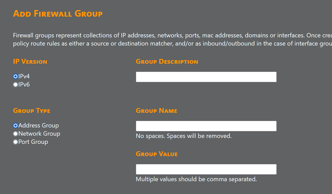
Another option if you dont want to have two hidden columns for the description vs textfield is to align it vertically instead as you did over at “Add firewall group” where the field name is in orange (on darkgrey), textfield and then tooltip below it if needed. drawback with vertical alignment is that this is less compact than doing it two-column style.
Similar to the “Choose file” at import to the left which doesnt seem to be centered over the yellow button as delete config selection is over its yellow button.
And the borders of the page would need some air aswell like at top between the yellow header and the darkgrey regular page. At bottom between “Download datafile” and the yellow footer. Or for that matter in the upper right where the logout button would need some air from both the header and the right side of the browser
When adding a group/table/flter the GUI incorrectly includes empty fields like so (the correct behaviour IMHO is that this config line should not be generated at all if its empty):
# Group:
set firewall group address-group description 'asdasd'
set firewall group address-group address ''

#
# Table: ddsfds
#
set firewall ipv4 name ddsfds default-action 'drop'
set firewall ipv4 name ddsfds description ''
Another handy thing would be if the generated config would exist in a textarea with a “Update” button at bottom (or top).
This way one could use the GUI to make a skeleton, click on “Display config” and then copy paste within the textarea (which probably goes way faster) and once done clicking on “Update”. This would be same as if you would first export the generated config, edit the config in notepad/gedit, import it back to the GUI.
Other than that this perhaps should/could be merged (or parts of it) with the ongoing VyOS GUI project as described at:
Create “Table” is this the correct wording that is also used in the Vyos documentation?
I think you need also a switch between the LTS version and the rolling release. I think in the future there are some difference with the commands that will be used here.
Continuing development and releasing approximately weekly. Today’s release includes ability to push configuration to a firewall over SSH using Napalm library.